An excellent presentation of the CD digipak design and the importance of album covers. I feel that you could have developed research more into the conventions of Album digipak's and addressed layout and design more closely. Excellent initial design's into CD covers for your group artist and good consideration to target audience. It can be developed with more deatiled annnotation of digipak conventions.
Friday 21 October 2011
Wednesday 19 October 2011
digipak cover so far

 embedded the necessary copyright statement, with Virgin Record label, as well as a barcode.
 I have used the effect of light leaks on the covers because we will be using this effect in our music video. I have also included the effect of broken glass to symbolise our track lyrics as well as because it is a relative theme through out our music video.
I have yet to include all of the band members in the front cover design, but my initial idea is to have a pop art effect of their faces as to give them a surreal image. I will also be including a 'special edition sticker'.


In class we talked about how to best present a digipack. We talked about two different artists whom had inspiration to famous artwork, Madonna and Barney Berwick.
Funeral to a friend are promoting intertextulity with reference to Rene Magritte ‘les amants’. The history of Rene Magritte’s painting is that two lovers committed suicide in a lake and drowned. Therefore, album cover is connoting death, which is an immediate link to metal, which is what sound the band is promoting.

Madonna’s icon album design of ‘celebration’ makes it marketable because it is taking inspiration from Mr.Brainwash, a pop art image of Marilyn Monroe.
Gives Madonna credibility, bringing her audience in with her influence by pop art and being relative.

I very much liked the reference to the famous pop art style done of Marilyn Monroe that Madonna used. I decided I wanted to experiment with this style of illustrating my cd template.
Monday 17 October 2011


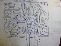
This is the CD digipack design that i created. I looked at the groups combined designs and created this. The bottom left hand image is the front cover with the band with objects behind them. It's important to show the band, since it is their first album cover, there is a need to exert their star image. The bottom right hand image is of the same as the front cover, with the objects, but it is without the band. I thought that this was a creative way of showing the bands sudden presence. The top right hand image is where the CD is placed. I would have a picture of a tin camera on this side, behind the cd. This is identifying, yet again, a sense of image and exposure. The top left hand image is of the lyrics of 'stay with me' with shards of broken glass in the background of the writing.
Friday 14 October 2011
Feedback
This is excellent work - there are evident clear accounts of your planning and research for your music video production day after half term. Your bog is regularly updated in terms of the production process.
I like the way in which decision making is evident along with reflection and revisions. Your cast list has been agreed and you need to post this with the shooting schedule.
There are one or two ways to develop the blog. First to begin using a wider range of blogging tools - there are lots of well presented images, but use of Flickr or powerpoint will increase the creativity that is shown on your blog. This way the images used will look more creative with the use of a presentational tool.
Second the valid, detailed and reflective comments that you make need to be developed further with key media concepts and theoretical ideas; for example, link the planning to star image, or how set design and lighting link to mise en scene and/ or what model's of lighting you are using in relation to your set - key, fill, directional, discuss the untensity and colour and what you are trying to represent about your artist. This will help make a more thorough evaluation of your work. Well done.
Process pictures


These are screen grabs of our timeline and how the images are cut.
The image to the right, is what it looks like when we put markers in the sequence, in order to mark a beat for the shot to change. This is what it is like to work using Final Cut Pro. I wanted to exhibit the process that we go through.storyboard evaluation

The purpose of storyboarding our shot choices is to configure the time needed for each shot. It is also a way to develop screen time needed for the instruments, artist and location. During this time we may find that we need more or less of a certain shot than we pre-determined. Equally, we may find it useful to cut certain shots all together, in order to best present our video. For example, we had an extreme close up of the drummer’s foot which we felt didn’t work, so we cut it at this stage of elimination.
The process involved our group using Final Cut Pro, to edit our storyboard. This was obviously useful as it is the editing package we will be using to complete the music video. For the animatic and at this stage of the planning, we chose the appropriate shot that would show the instrument playing at that point in the track. When there are pauses in the song, we have placed images of the dancers or a wide shot of the band. We have also placed a marker on the points where there are beats in the song, which helped create rhythm to the shot transitions.
There is a balance between narrative and performance because we have included the band as well as the story that the song is suggesting. We kept in mind that the band needs the majority of screen time because it is a new band and need publicity. The narrative, involving the dancers, is also an important feature in order to relate to our target audience. At this stage I feel we have managed to create an accurate balance between the two.
We have also learnt how to spread out the time equally for each of the group members to partake in the editing. We usually worked in two’s with one person on the mouse and another commenting, and then we’d switch. This process of establishing a team meant our work was finished quicker because we were all involved in managing different roles. We contributed in an efficient way, where we would split up and work on different areas such as the CD template, prop list and cast list, which gave us a good end product. The above image is of my part in filming the storyboard.
Thursday 13 October 2011
shooting schedule
Shooting Schedule
Establishing shot of band
The empty room (establishing wide shot)
Close up Of Singers Face
Close up of singers lips
Close up of singers hand holding microphone
Shot of lead guitarist playing
Close up of lead guitarists hands
Shot of Secondary guitarist Playing
Close up of Secondary guitarists face
Close up of secondary guitarists Hands
Shot of bass guitarist playing
Close up of bass guitarists hands
Mid shot of drummer playing
Close up of drummers hands drumming
Close up of drummers foot on pedal
Close up of belt buckle
Close up of dancers faces looking at each other
Mid shot of dancers standing away from each other looking towards each other
Close up of dancers heads touching
Shot of Girl dancer leaping into his arms x3 (different types of lifts)
Shot of Boy running his fingers through girls hair
Shot of dancers kissing aggressively Close up & mid shot
Shot of him lifting her up (against a wall) mid shot
Shot of him pulling her towards him
Shot of them sat back to back On floor (girl crying boy looking down)
Shot of them dancing there routine
Shot of them kissing
Shot of her leaping into his arms
Shot of them looking into each others eyes
Shot of them crying
Feedback from Dan (the set layout man)
- Because another group decided on a similar lighting design as ours, we chose to scrap the wholes with lighting in the back and have chosen to uses dangling light bulbs in the foreground and strobe lights in the backdrop. We will also have key lights and fill lights on the subject. We will have a nice 'push and pull' effect with our shots because of the depth of field with the bulbs and band members.
- We are also going to have a dangling bits of mirror shards, in the band shots, in order to create a link to our other shot, where we have the dancers reflected in broken bits of mirror.


The above image is an example of the 'push and pull' effect that we want.
We also have decided to include dry ice to use as an effect. We are also ordering some sliced of silver glitter so link with the broken bits of mirror. The broken mirror slices and glitter are representing the fragmented relationship narrated in the song lyrics.

Wednesday 12 October 2011
Prop List
We chose to show objects suchas the aplifiers, speakers and cables. I believe that including objects that would normaly be seen off-set, lets the viewer connect more to band. A theatre pratitioner, Bertolt Brecht, wanted to create an impact on his audience and wanted to involve them in any matter of way possible. By revealing the set, it's reminding them that what they are watching is a performance, not real. It creates a way of bringing the actors down to the audiences level so that they can better relate. I think its vital for an artist to have a relationship with their fans and by revealing more it makes the audience feel as though they are present. For example, Brittney Spear's, ' I love rock and roll' exposes parts of their set.
set design
1)

2)
3)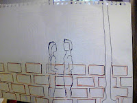
Our group came up with the concept above, Hannah in our group drew these out. The majority of our music video is in the studio with the set being similar to numer 1)above. Number 3) is showing the portion of our music video that is shot outside infront of a wall. This shot is purely for the dancers, not the band. Number 2) is how we are establishing our angle of shot. We are filming part of our shots at a wall with broken bits of mirror on it. The mirror will be reflecting the dancers.
Tuesday 11 October 2011
Completing the look of the set
11th October
Aim: To complete and upload animatic storyboards. Complete props list and blog- evaluate in relation to mise en scene. Submit casting list if you have not done so already, Set design- have you prepared sketches, colour scheme and design of the set and lighting- if so evaluate in terms of mise en scene and the look of your music video.
We decided to use circular lighting in the background of our set. something similar to this one done below.
We are prodominantly using artificial light. This back-lighting in particular is a dozen or so spotlights on the back. We will make use of silhouetting since it is very easy to do when we are using bold backlighting. We will also use front key and fill lighting to highlight the band members faces.
We are prodominantly using artificial light. This back-lighting in particular is a dozen or so spotlights on the back. We will make use of silhouetting since it is very easy to do when we are using bold backlighting. We will also use front key and fill lighting to highlight the band members faces.
This lighting creates a link to the song we have chosen because it represents the wholes in the couples relationship. The lyrics show the man's realisation of the what his girlfriend is, so the light peering in through the wholes shows clarity.
Subscribe to:
Posts (Atom)