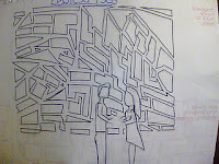
Above is our groups finished product of our music video. What i value most of what i've learned through the editing process is how to crop shots down, which was necessary for our video since often the mirrors would swing the wrong way. I am glad that the light leek effect that i came up with worked in representing the lovers changing emotions. Unfortunately we didn't manage to get a lot of useful footage from some members in the band but we made do by making the instruments a key feature. What polished off our video was making it HD allowing all the quality to come through.
Thursday 1 December 2011
Finished product
Above is our groups finished product of our music video. What i value most of what i've learned through the editing process is how to crop shots down, which was necessary for our video since often the mirrors would swing the wrong way. I am glad that the light leek effect that i came up with worked in representing the lovers changing emotions. Unfortunately we didn't manage to get a lot of useful footage from some members in the band but we made do by making the instruments a key feature. What polished off our video was making it HD allowing all the quality to come through.
Saturday 26 November 2011
Feedback
What you have posted takes evident account of the set design, this is very good in presentation and argument, cold be linked a little more closely to Mise en scene. At the same time, I feel you could have extended your blogging to shot selection, camera and shot selection. This would have helped develop your blog and evaluation of shoot day. Well done nonetheless
Wednesday 23 November 2011
account of shoot day
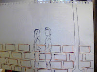
When placing the band on set we had to make sure that the mirrors weren’t covering them and that the light bulbs were correctly in place. As I predicted from set-up day, the single sided mirrors posed an issue since they spin and expose a non-reflective surface. We overcame this challenge in close-up shots by having someone stand below holding the mirror in place. I did this on a few occasions. The broken mirrors gave a great end result in achieving the narrative of the song within the broken relationship between the couple and as well as showing different angles of the band members simultaneously.
We instructed the band to wear their ever-day clothes in order to create a better link to the young fashion and also giving them a sense of normalcy.
I mentioned at the start of the project that I wanted to have a ‘light leek’ effect in the music video, where the lights would blur. The group agreed with this, which is why it is a key element in the CD digipak that I designed. On shoot day we each tried to get this ‘push-pull’ effect with the focus on the camera. This was one of our significant shots because the reason for the ‘push-pull’ effect was to show the inconstant relationship between the dancers and the narrative. The idea is to put these shots in the introduction and the ending.
When I was working on the sound by playing back the song, I became familiar with the lighting as well. I was considering using the Fresnel because it gave an indifferent colour to set. However, we designed the set with specific lighting and adding extra light sources would detract away from the strobe lights and light bulbs.
After shooting the band we filmed the dancers, Sophie and James. We allowed the dancers to get familiar with their working area and did a few test shots to see where the dancer would be at every jump, fall and turn.
I filmed for some of this section, in different angles to where the dancers would meet. We also decided to use a high angle shot by using the genie-lift. We wanted to give the effect that we (as an audience) are looking onto the story and judging it. The dancers had two costumes each for the day; casual wear and black dace gear. By doing this we are establish two sides to the characters.
We kept some mirrors and light bulbs in the background in order to create a direct link to the band.
I feel as though our production ran smoothly. The band members achieved the intensity we wanted in every take, along with the dancers putting a lot of effort into showing a passionate, aggressive and changing relationship. I am glad with how neat the process was and how we did not come across any major issues.
Tuesday 22 November 2011


Monday 21 November 2011
set up for the set
- We began by first hanging up the dangling bits of plastic mirror. We will place the band members in the centre of them. The reflective surface is not double sided, which in lies the problem we might find that the mirrors will spin, exposing the plain side.
- Hung the light bulbs up to dangle in the air alongside with the mirror shards. Last minuet decided to use green and blue coloured light bulbs as well as the see-through ones.
- Last preparation made was sticking other broken bits of plastic mirror onto a black board. This is to film the dancers reflection through. We may need to cover another board to achieve the desired effect.
Saturday 19 November 2011
Feedback
Excellent blogging well done, addresses evaluation well. Only area for development is not to simply post photos onto blogger, but use a presentation tool.
Wednesday 16 November 2011
Evaluation of CD digipak
- For the CD cover we first only had one member of the group in the cover, making it an inadequate portrayal of the band. Our group then arranged another photo shoot with the other band member bar one. I photographed this and created the CD cover with these images. Because we are still missing a band member we will include him at a later date.
- · The design theme of broken glass and light leeks was what the group and I decided to use in the CD digipak. Both of these elements are key in our music video to represent the relationship within the narrative.
- The conventions for the design of the CD is that I have included; the barcode, record label, the band name in the stem of the cd, and copyright statement.
- · Upon prior development of the band we researched bands that optimise what we wanted our band to look and sound like. Among the researched bands, one of the similar bands to Synergy is Kid’s in Glass Houses.
- · I decided to choose the font ‘bleeding cowboys’ in red in order to illustrate the sexual appeal of the band. The font is a flowing, punkie look to show the style of the band.
- · We were trying to represent a young, mainstream boy band about to make it big in the industry. I believe that this was achieved by showing a relaxed atmosphere within the CD cover.

- · The music video, poster and CD digipak are three different products used to promote the band in order for their song sales to boost. They are also essential in gathering a fan base for the band, which leads to a rise in concert sales.
- · The general feedback from those that I have asked about the CD digipak, is that it is a clear presentation of the band and has a desirable quality. I would like to change the fact that I still have one member missing from the photograph.
- · Because I have taken photography I am aware of how Photoshop works which came in handy for this task.
completed CD digipak

I have re-done the CD cover as well as adding information about the band on the inside right side, on the far left. I have also included the bands name as well as their main song on the stem of the CD.
Tuesday 15 November 2011
3rd cd digipack

Design finished with the title included. Now all that is left is the inside packet with information about the band, the barcode and copyright.
2nd draft of digipak

For this image, we found it relative to use light leeks in the background, because that is what we are going to include in the actual music video. In our video we are using light bulbs that when the depth of field is manipulated, the unfocused effect of the lights is what is shown on the cd cover above. There are separate layers on the right hand side to edit each individual image without effecting the others.
Monday 14 November 2011


Friday 21 October 2011
Feedback
An excellent presentation of the CD digipak design and the importance of album covers. I feel that you could have developed research more into the conventions of Album digipak's and addressed layout and design more closely. Excellent initial design's into CD covers for your group artist and good consideration to target audience. It can be developed with more deatiled annnotation of digipak conventions.
Wednesday 19 October 2011
digipak cover so far

 embedded the necessary copyright statement, with Virgin Record label, as well as a barcode.
 I have used the effect of light leaks on the covers because we will be using this effect in our music video. I have also included the effect of broken glass to symbolise our track lyrics as well as because it is a relative theme through out our music video.
I have yet to include all of the band members in the front cover design, but my initial idea is to have a pop art effect of their faces as to give them a surreal image. I will also be including a 'special edition sticker'.


In class we talked about how to best present a digipack. We talked about two different artists whom had inspiration to famous artwork, Madonna and Barney Berwick.
Funeral to a friend are promoting intertextulity with reference to Rene Magritte ‘les amants’. The history of Rene Magritte’s painting is that two lovers committed suicide in a lake and drowned. Therefore, album cover is connoting death, which is an immediate link to metal, which is what sound the band is promoting.

Madonna’s icon album design of ‘celebration’ makes it marketable because it is taking inspiration from Mr.Brainwash, a pop art image of Marilyn Monroe.
Gives Madonna credibility, bringing her audience in with her influence by pop art and being relative.

I very much liked the reference to the famous pop art style done of Marilyn Monroe that Madonna used. I decided I wanted to experiment with this style of illustrating my cd template.
Monday 17 October 2011


This is the CD digipack design that i created. I looked at the groups combined designs and created this. The bottom left hand image is the front cover with the band with objects behind them. It's important to show the band, since it is their first album cover, there is a need to exert their star image. The bottom right hand image is of the same as the front cover, with the objects, but it is without the band. I thought that this was a creative way of showing the bands sudden presence. The top right hand image is where the CD is placed. I would have a picture of a tin camera on this side, behind the cd. This is identifying, yet again, a sense of image and exposure. The top left hand image is of the lyrics of 'stay with me' with shards of broken glass in the background of the writing.
Friday 14 October 2011
Feedback
This is excellent work - there are evident clear accounts of your planning and research for your music video production day after half term. Your bog is regularly updated in terms of the production process.
I like the way in which decision making is evident along with reflection and revisions. Your cast list has been agreed and you need to post this with the shooting schedule.
There are one or two ways to develop the blog. First to begin using a wider range of blogging tools - there are lots of well presented images, but use of Flickr or powerpoint will increase the creativity that is shown on your blog. This way the images used will look more creative with the use of a presentational tool.
Second the valid, detailed and reflective comments that you make need to be developed further with key media concepts and theoretical ideas; for example, link the planning to star image, or how set design and lighting link to mise en scene and/ or what model's of lighting you are using in relation to your set - key, fill, directional, discuss the untensity and colour and what you are trying to represent about your artist. This will help make a more thorough evaluation of your work. Well done.
Process pictures


These are screen grabs of our timeline and how the images are cut.
The image to the right, is what it looks like when we put markers in the sequence, in order to mark a beat for the shot to change. This is what it is like to work using Final Cut Pro. I wanted to exhibit the process that we go through.storyboard evaluation

The purpose of storyboarding our shot choices is to configure the time needed for each shot. It is also a way to develop screen time needed for the instruments, artist and location. During this time we may find that we need more or less of a certain shot than we pre-determined. Equally, we may find it useful to cut certain shots all together, in order to best present our video. For example, we had an extreme close up of the drummer’s foot which we felt didn’t work, so we cut it at this stage of elimination.
The process involved our group using Final Cut Pro, to edit our storyboard. This was obviously useful as it is the editing package we will be using to complete the music video. For the animatic and at this stage of the planning, we chose the appropriate shot that would show the instrument playing at that point in the track. When there are pauses in the song, we have placed images of the dancers or a wide shot of the band. We have also placed a marker on the points where there are beats in the song, which helped create rhythm to the shot transitions.
There is a balance between narrative and performance because we have included the band as well as the story that the song is suggesting. We kept in mind that the band needs the majority of screen time because it is a new band and need publicity. The narrative, involving the dancers, is also an important feature in order to relate to our target audience. At this stage I feel we have managed to create an accurate balance between the two.
We have also learnt how to spread out the time equally for each of the group members to partake in the editing. We usually worked in two’s with one person on the mouse and another commenting, and then we’d switch. This process of establishing a team meant our work was finished quicker because we were all involved in managing different roles. We contributed in an efficient way, where we would split up and work on different areas such as the CD template, prop list and cast list, which gave us a good end product. The above image is of my part in filming the storyboard.
Thursday 13 October 2011
shooting schedule
Shooting Schedule
Establishing shot of band
The empty room (establishing wide shot)
Close up Of Singers Face
Close up of singers lips
Close up of singers hand holding microphone
Shot of lead guitarist playing
Close up of lead guitarists hands
Shot of Secondary guitarist Playing
Close up of Secondary guitarists face
Close up of secondary guitarists Hands
Shot of bass guitarist playing
Close up of bass guitarists hands
Mid shot of drummer playing
Close up of drummers hands drumming
Close up of drummers foot on pedal
Close up of belt buckle
Close up of dancers faces looking at each other
Mid shot of dancers standing away from each other looking towards each other
Close up of dancers heads touching
Shot of Girl dancer leaping into his arms x3 (different types of lifts)
Shot of Boy running his fingers through girls hair
Shot of dancers kissing aggressively Close up & mid shot
Shot of him lifting her up (against a wall) mid shot
Shot of him pulling her towards him
Shot of them sat back to back On floor (girl crying boy looking down)
Shot of them dancing there routine
Shot of them kissing
Shot of her leaping into his arms
Shot of them looking into each others eyes
Shot of them crying
Feedback from Dan (the set layout man)
- Because another group decided on a similar lighting design as ours, we chose to scrap the wholes with lighting in the back and have chosen to uses dangling light bulbs in the foreground and strobe lights in the backdrop. We will also have key lights and fill lights on the subject. We will have a nice 'push and pull' effect with our shots because of the depth of field with the bulbs and band members.
- We are also going to have a dangling bits of mirror shards, in the band shots, in order to create a link to our other shot, where we have the dancers reflected in broken bits of mirror.


The above image is an example of the 'push and pull' effect that we want.
We also have decided to include dry ice to use as an effect. We are also ordering some sliced of silver glitter so link with the broken bits of mirror. The broken mirror slices and glitter are representing the fragmented relationship narrated in the song lyrics.

Wednesday 12 October 2011
Prop List
We chose to show objects suchas the aplifiers, speakers and cables. I believe that including objects that would normaly be seen off-set, lets the viewer connect more to band. A theatre pratitioner, Bertolt Brecht, wanted to create an impact on his audience and wanted to involve them in any matter of way possible. By revealing the set, it's reminding them that what they are watching is a performance, not real. It creates a way of bringing the actors down to the audiences level so that they can better relate. I think its vital for an artist to have a relationship with their fans and by revealing more it makes the audience feel as though they are present. For example, Brittney Spear's, ' I love rock and roll' exposes parts of their set.
set design
1)

2)
3)
Our group came up with the concept above, Hannah in our group drew these out. The majority of our music video is in the studio with the set being similar to numer 1)above. Number 3) is showing the portion of our music video that is shot outside infront of a wall. This shot is purely for the dancers, not the band. Number 2) is how we are establishing our angle of shot. We are filming part of our shots at a wall with broken bits of mirror on it. The mirror will be reflecting the dancers.
Tuesday 11 October 2011
Completing the look of the set
11th October
Aim: To complete and upload animatic storyboards. Complete props list and blog- evaluate in relation to mise en scene. Submit casting list if you have not done so already, Set design- have you prepared sketches, colour scheme and design of the set and lighting- if so evaluate in terms of mise en scene and the look of your music video.
We decided to use circular lighting in the background of our set. something similar to this one done below.
We are prodominantly using artificial light. This back-lighting in particular is a dozen or so spotlights on the back. We will make use of silhouetting since it is very easy to do when we are using bold backlighting. We will also use front key and fill lighting to highlight the band members faces.
We are prodominantly using artificial light. This back-lighting in particular is a dozen or so spotlights on the back. We will make use of silhouetting since it is very easy to do when we are using bold backlighting. We will also use front key and fill lighting to highlight the band members faces.
This lighting creates a link to the song we have chosen because it represents the wholes in the couples relationship. The lyrics show the man's realisation of the what his girlfriend is, so the light peering in through the wholes shows clarity.
Friday 30 September 2011
Excellent your response is detailed and through and you have been creative with your blogs, I particularly like the use of headings with good layout and design - excellent exploration of logo. You have a secure knowledge and understanding of who you want your artist to be signed to; perhaps you could link this further by stressing the advantages that your artist has signed to the particular record label.
Your need to identify your target audience and have to profile them. Develop this with the use of VALS. Good research into CD covers and you have a wide range of examples, and this would be developed further if you can link the real product to how it will influence your own designs.
Your need to identify your target audience and have to profile them. Develop this with the use of VALS. Good research into CD covers and you have a wide range of examples, and this would be developed further if you can link the real product to how it will influence your own designs.
Excellent blogging of media and online age - how does McLuhan' idea's work with your blog?
Thursday 29 September 2011
Discussions and debates of the online age
In 1964 Marshall Mcluhan says, “we shape our tools and thereafter our tools shape us”. From what i understand of Mcluhan's statement, we develop technology which then in turn advances us. However the opposing argument is that we knew how to live without them when they weren’t accessible but now that we have technology nobody could fully function without it. Mcluhan is suggesting that there is a two-way relationship between the tools that we use. Our generation and the one above, where teenagers and businessmen are the top culprits of being dependent on technology, where as the older generation is happy without it. I believe that the people are beginning to let technology determine our lives. Starting with 'stay at home mums' that have a busy schedule with their children and so order their groceries online and get it delivered to their house instead of driving to the supermarket. We rely on these tools to get on with our day to day activities. The proliferation in using the internet to perform basic tasks such as this is what will set people into becoming utterly dependent on having the internet.
Michael Wesch argument is that ‘the machine is us/ing us.’ This is a different perspective from Mcluhan who claims that technology is bettering man kind. Wesch is concerned that technology may in fact de-humanities us. Facebook is another social networking site which lets people communicate with one another. However, Facebook can get your information and send junk mail to your Hotmail account. A similar question is asked about Facebook and how if it defines our lives. The people who advocate this in the industry are advertisement companies who get profit from advertising their products through Facebook.
Narration
The narrator tells the story of the song through the video. Our narrator in our song is the band because they are telling the story of a couples break up, keeping the story separate from themselves. The point of view is important because it is positioning the audience in taking a certain angle of vision. The message is constructed in storyboarding of whichever point of view we want the audience to associate with, which is why it should be carefully analysed. We have decided to apply narrative through the performance so that the story is separate from the band. Sometimes in music videos, the artist will narrate as well as being the story itself. An example for where this is applied is in Beyoncé’s song ‘Irreplaceable’.
One of our group members has informed me that the name of our band, '3s a crowd' already exists as a band. I then came up with the name 'Synergy'. I chose it because it is a typical term used in media to describe co-operation and working together. This gives a nice image for the band, in that they are a strong group. We also decided to get rid of '3s a crowd' because we have considered using more band members and so the message would no longer be relevant.
Tuesday 27 September 2011
Digipak covers of similar CD covers for our band


Since our band is breaking into the industry and are unknown to the world, they need to show their band members to the public so that the public can identify with them for the fist time. This contributes to the star image because they are being established in a visual sense, this is where music videos play a big factor. The target audience of the band would relate to the band because of their style and looks which would make for sales. All of these album covers were probably the first of their covers because as the artist becomes more popular, there is no need to present themselves onto the cover. They can put an image relating to their music or theme.
Monday 26 September 2011
Institutional context of your 'You Me at Six'
-The labels for You Me at Six are Virgin, Epitaph and Slam Dunk.
- Virgin records began as an independent, British recording company in the early 1970s. However since then it has branched worldwide and has become big in America. Virgin has produced subsidiary labels, however the success of them failed and often times were reduced to surrendering their artists to Virgin. Since Virgin made secure nests in America, their artists, unlike many British labels, can be transmitted worldwide.
- Virgin records began as an independent, British recording company in the early 1970s. However since then it has branched worldwide and has become big in America. Virgin has produced subsidiary labels, however the success of them failed and often times were reduced to surrendering their artists to Virgin. Since Virgin made secure nests in America, their artists, unlike many British labels, can be transmitted worldwide.
-Virgin is one of the UKs largest privet companies. There was revenue of £250m in 1986 on the stock exchange. The company became valued at £240m after the decision was made to make the company privet. The reasons for this were because the founder, Richard Brandson did not wish to conform to the rules of leading public regulated companies. He also found it time consuming and costly to report back to share holders. The share price began to fall, which is why I believe it to have been a good decision of Brandson’s to close the company to becoming privet. The shares were bought back at the same price as when they were sold and the business went back to privet ownership. The company invested in other shares in the market without the repercussions that multinational companies tend to fall under.
- The fact that You Me at Six are represented by a company with such a large success rate, makes them a good commodity.
-The target audience would range between fifteen and twenty-one year olds, as there music exhibits elements of a young nature. The audience can be young men as well as women because of their style that men would like to emulate.
resources: 'Exploring Corporate Strategy' esecourses.com/cfincase.pdf
resources: 'Exploring Corporate Strategy' esecourses.com/cfincase.pdf
Thursday 22 September 2011
My logo design ideas


Since this is a new band on the market, I chose to represent a deer in my logo displays to show the potential leap in their career. The colour scheme I went for was dark brown and cherry red because they are more or a manly colour and a woman's. I wanted to involve natural elements, so I tried out a rose, leaf, tree, and fire backdrop.
Pitch feedback
The general over view from Luke was that he liked how we were representing the narrative of the story through the dancers and having the band as narrators. He commented on how we could not use our initial location at the mansion, since there had been some previous issues with that location because of the sound. We have chosen to try and find a similar room, along the lines of a victorian style drawing room.

Tuesday 20 September 2011
Tuesday 20th September- continued discussion into target audience
Continued development on the pitch and target audience
Watched an interview with Jerry Goolsby whose general message is that the music taste of a person who is 23 will be significantly different from someone who is 40. You need to have a specific audience that your targeting, or else you don’t have a product. Whilst Goolsby's theory is interesting and is certainly applicable in lots of cases, I would also argue that it does not always apply. Other artists such as Adele, Rolling Stones, for example have wide appeal across broad age groups.
We revaluated our group's target audience and came to the conclusion that the primary target is 15-21 year old boys and girls. The person would be quite involved with music as it not the kind of band you would listen to on the offchance. Someone who goes to concerts would be a keen listener of our band.
Defining an audience:
- The audience is constructed by details. Rather than thinking of the audience as a mass you need to look at the age range and what is of interest. Segmenting the audience into mainstream or niche. The segmentation can be achieved both psychographically and demographically.
- Demographic segmentation is where an audience is split according to numerous significant social criteria e.g. class, race, sexuality, gender. JICNARS scale is one of the most common demographic approaches that involve the audience.
- The JICNARS (joint advertising committee for television advertising research) scale:
- A- Higher management/administration/professional ( a vice president of a company,
- B- middle management/administration/professional (teacher, store manager, journalist) largest spending power
- C1- Supervisory/clerical/ junior management (secretary)
- C2- skilled manual (builder, plumber)
- D- Semi and unskilled manual (fastfood worker, shop worker)
- E- subsistence income/ pensioners/widows/ casual labour/ unemployed
The majority of music sales come from rows C-E because
Psychographic segmentation is an amalgamation of a consumers profile and the ideas about how they manage their life. To predict consumption of the public, various attitudes, values, beliefs and ‘lifestyle’ choices are sorted into a number of specific categories. Successful market is premised upon who is your market.
People are broken down also into different type groups as; actualises, fulfillers, achievers, and experiencers. Our group is working with ‘experiencers’, which is the teenage category.
The broken down teenage category;
Cowboys- who want easy money
Cynics- who have to have something to complain about
Utopians- who want the world to be a better place
Traditionalists- who wants things to stay the same
Drop outs- who shun commitment of any kind
Drifters- who are not sure what they want
Groupers- who just want to be accepted
Rebels- who wish to remake the world in their own image
Innovators- who wish to make their mark
Puritans- who wish to feel virtuous
Trendies- they crave the attention and admiration of their peers
Our group category is under drifters because their music category is not completely mainstream and not completely indie or punk. Our type of pop punk/soft rock can be enjoyed by a large spread of people because of its versatility of sound.

Monday 19th September classnotes
The pitch and target audience
Objective: to complete the pitch to your teachers.
Aim: Developing the pitch.
In groups, create a pitch of your ideas to deliver to Luke and Jason either Thursday or Friday this week.
A successful pitch means your project will be green lighted.
Aims: knowing who your target audience is.
Band name: 3s a crowd
Genre: pop punk. Ellements of star image: Alternative fashion image, all play instruments. Not conforming to the stereotype of the typical boy band, being only three members.
Targer audience: 15-24 boys and girls
Choice of track : ‘stay with me’ by You me at six.
Overall concept of video, Performance, narrative, and thematic elements: narrative driven about a broken up relationship. Relating the band to broken hearted couples. Dance scene, reflecting the passion of the relationships. Their star persona is going to be promoted by the music video.
Ideas for key individual shots/scenes: Establishing shot, Dancers close together, main singer close ups, shots of dancers, band, slow motion smash (tiny temper video reference of him strip lights). Extreme close ups. Show off the bands style, with extreme close up of clothes, product placement?
Scenery shots: mansion and studio.
Influences: Blink 182, white stripes, paramour. Rhiana, ‘love the way you lie’-relationship between the boy and girl.
Monday 19 September 2011
Lyrics broken down into our shot choices
Image of whole band in intro
You've got a lot to say – shot of whole band, establishing them andlocation
for the one that walked away. – close up of lead singer
I give you take, - shot of couple looking into each others eyes
its the way it's always been
Oh how do I know - Shot of lead singer
if I should stay or just go - Shot of guitar
the bottom line is this way that I'll never know –Shot of drummer
Stay with me – run and jump passionately
stay with me – running fingers through hair aggressively
- walking away from each other
You got a lot to say
I give you take – him begging and shouting
some things they never change –shot of whole band
just change –lead singer close up
Stay with me – leap into arms again
stay with me –fighting grabbing her
Never know I could be this way – girl running from boy- he grabs her
never know that I could walk away – kiss aggressively and passionately
Him smashing a mirror
These things take time to grow – her crying, makeup down face
it's been said that time heals wounds – cut back to smashing mirror
but no – Him pulling her towards him aggressively, I won't be controlled – shot of singer
and so, this story goes – whole band shot
Boy and girl gentle walking away turn around
Stay with me – run at him screaming and crying into his arms
stay with me – kissing passionately
Never know I could be this way – mid shot of band
never know that I could walk away – boys walks leaves girl crying in the distance – close up of lead singer
for the one that pushed me away –shot of girl packing bags leaving him
Shot of whole band finishing playing
Album cover idea moodboard


Since we are promoting a new and up-coming band, we need to include all of the band members. This makes the audience aware of their style and who they are. Image is crucial in selling a band, once the image has been made and successfull, there is no need for the band to appear in the album cover anymore. Whatever the music is promoting or what the band wants to present, is what will appear on the cover of the album. Below are some examples of the album cover after the band has been established.


Subscribe to:
Posts (Atom)